Actually storing images for Blogger posts is very easy,
just click the upload image icon then select an image on the computer then the
image will appear in the blog post. But of course the pictures we must set the
location and size to look good and neat and not too burdensome loading blog.
For that reason, in adding image posts, do not be
haphazard with only limited uploading of images in the post and then just leave
it.
But make it a habit to correct HTML post code, such as
removing styles that are installed inline like <div style =
"text-align: center;"> and others. That's because the style
installed inline can contribute to loading the blog.
The best way is to use CSS styles from HTML edits, for
example for <div style = "text-align: center;"> tag, we change
it to <div class = "center"> with CSS saved in HTML edits as
follows:
.center {text-align: center;}
Likewise for picture posting, especially for AMP HTML
blog post pictures (this actually applies to all types of blogs), the location
and size of the image should be set with CSS from HTML editing.
Please save the following CSS code in the HTML edit for
the posting page style (for AMP blogs, save for the syle page posting for
desktop and mobile views).
.img-center{text-align:center;margin:0 auto;}
.img-left{clear:left;float:left;margin-bottom:1em;margin-right:1em;text-align:center;}
.img-right{clear:right;float:right;margin-bottom:1em;margin-left:1em;text-align:center;}
.img-width-300,.img-width-400,.img-width-500,.img-width-600{width:100%;text-align:center;clear:both}
.img-width-300{max-width:300px;}
.img-width-400{max-width:400px;}
.img-width-500{max-width:500px;}
.img-width-600{max-width:600px;}

@media screen and (max-width:640px){
.img-width-500.img-left,.img-width-500.img-right,.img-width-600.img-left,.img-width-600.img-right{clear:both;float:none;margin:1em auto;text-align:center;}}

@media screen and (max-width:414px){
.img-width-300.img-left,.img-width-300.img-right,.img-width-400.img-left,.img-width-400.img-right{clear:both;float:none;margin:1em auto;text-align:center;}}
1. For images with widths equal to or greater than the
width of the posting page, we simply add the layout = "responsive"
code to the amp-img tag as follows:
<amp-img src="/img/amp.jpg"
      width="1000"
      height="564"
      layout="responsive"
      alt="an image"></amp-img>
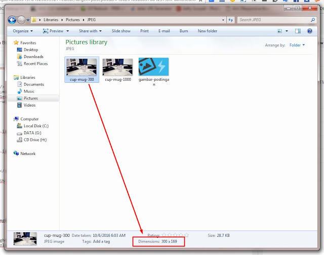
2. For images with a width smaller than the width of the
posting page, for example with a width of 300px, 400px, 500px, or 600px (we
assume that the width of the post is 700px).
If without adding layout = "responsive", then
by default the image will be on the left but it will be cut off on the device
screen that is smaller than the width of the image.
Meanwhile, if layout = "responsive" is added to
the image, the image will become blurry.
The solution is to use the class in CSS earlier. please
change the code
<div class="separator" style="clear: both; text-align: center;">
<div class="img-width-300 img-center">
<div class="img-width-300 img-center">
<amp-img src="/img/amp.jpg"
      width="300"
      height="169"
      layout="responsive"
      alt="an image"></amp-img>
</div>
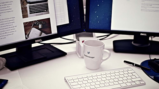
Example of a 300px image size with layout =
"responsive" without the class img-width-300 img-center:
If the image wants to be on the left or right side, then
we just need to replace the img-center code with img-left or img-right.
Image of AMP HTML Blog Posts
Likewise with img-width-300, if the width of the image is 400px (or width below 500px) then please change it to img-width-400. Likewise for images with a width of 500px (or width under 600px) or 600px (or width under 700px) (we assume that the posting width is 700px), please replace with img-width-500 or img-width-600.
Please right-click on this page then inspect element then
Ctrl + Shipt + M to look on various device displays. How, easy right?
Hopefully this post can be understood so that your blog
posts are always valid AMP HTML.


